This guide will help you use a modular template approach to your email's design and code, with a reusable framework for a more efficient workflow. It will improve the quality and consistency of your campaigns while saving you time on common, repeatable email production workflows.
While setting up an email design system requires some up-front work, it simplifies your day to day workflow, saving you a lot of time in the long run.
Below are the areas covered, in two sections: design, and code.
Your company brand should have a style guide for all communications, both visually for your creatives and verbally for your copy. A modular email template would utilize the style guide and go even further in keeping your campaigns consistent in tone, quality, and overall user experience.
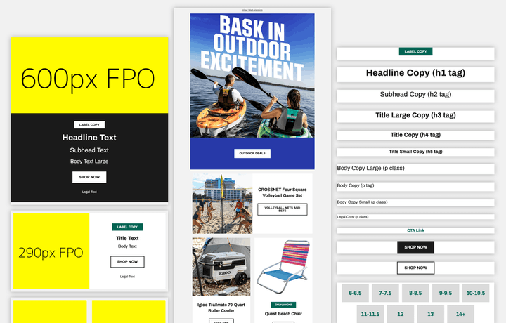
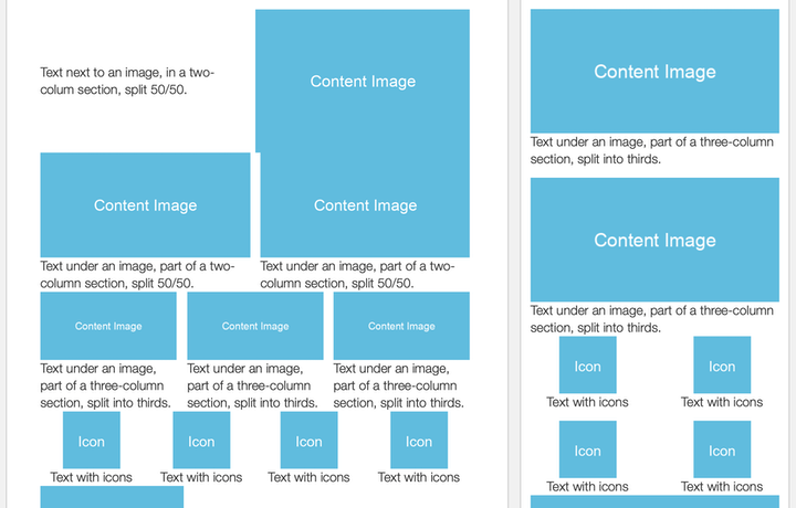
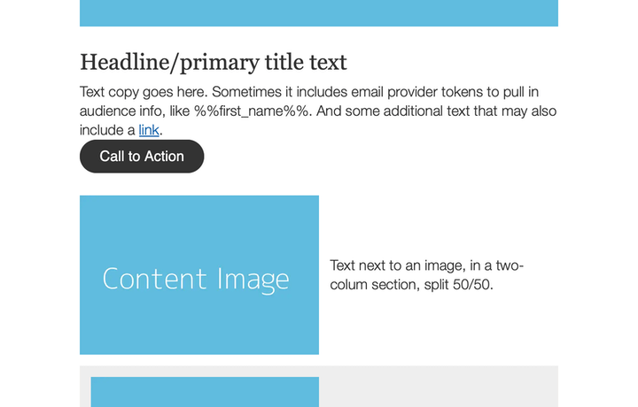
A template should use modular self-contained pieces, typically consisting of:
 Content
 Components
 Regions
 Sections
Components are the building blocks of your content and should work by themselves in a range of contexts. Regions are content pieces and components arranged in a specific way. And, Sections are full-width horizontal containers stacked on top of each other to create an overall layout.
Keep this hierarchy in mind and introduce it to your team as you design and build your templates. Having an underlying foundation allows everyone to better organize what they're already doing and essentially speak the same language throughout your email's workflow.
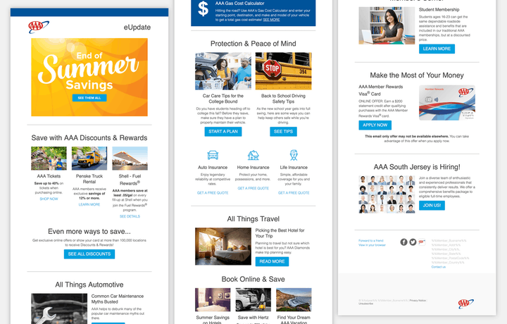
Strategy, design, and content tips for various categories of emails sent out.
Essential components - a collection of modules used on a variety of common email types
Starter email components
Using standard layouts
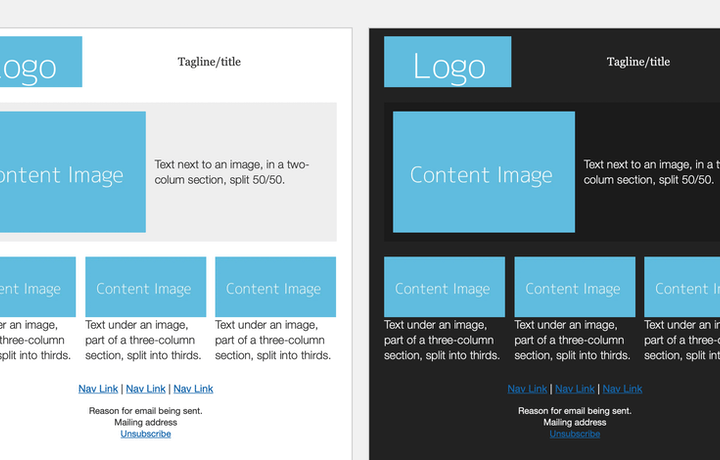
The same essential layout, each with completely different branded designs
Utilizing color for tone
Using different color palettes while keeping layout and formatting consistent
Components that work together
Components that are reusable and plug into and along side each other
Layout styles to break up content
Glanceable reading by using a wide range of content layout options
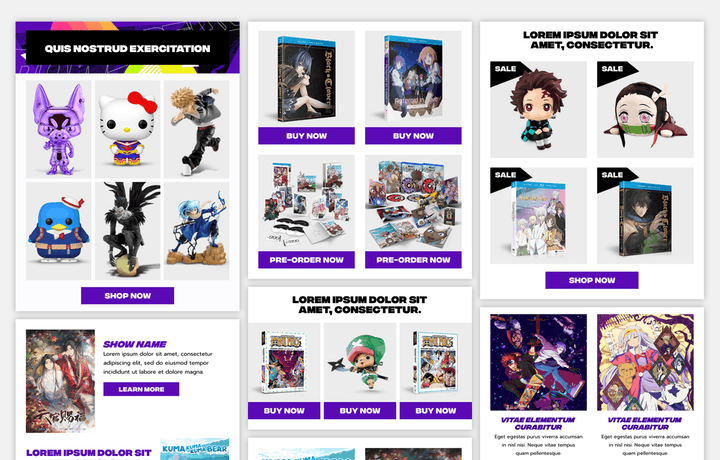
Creative collage layouts
Collage-based visuals to promote a wide range of products
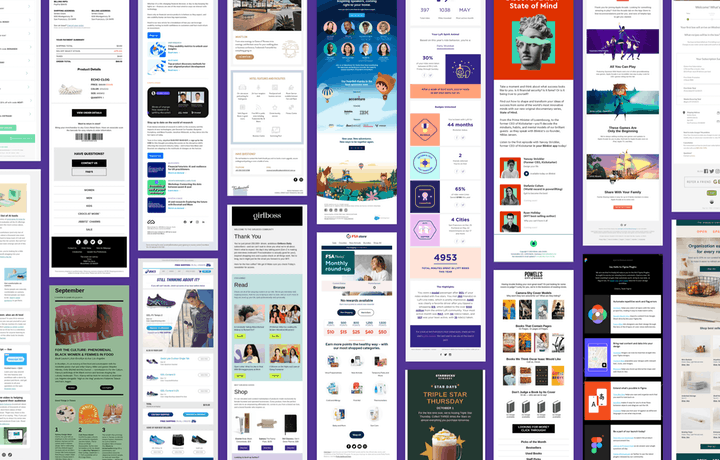
Choose the approach for coding your master email template that you're most comfortable with. Learn by example by looking at other people's code. Take advantage of libraries, template systems, and frameworks.
role="presentation"h1, h2, h3, etc) and paragraph tags (p)lang="en") — languages referencetitle="")Add to global styles to make adjustments:
@media (max-width: 480px) { }
480px breakpoint accounts for mobile devices with larger screens.
Tell email clients your preferred dark mode settings, for the ones that follow it:
<meta name="color-scheme" content="light dark">
light dark means both are supported.light only means only light styling is.
And within the CSS:
        :root {

          color-scheme: light dark;
Then make adjustments in your CSS using the dark mode media query:
@media (prefers-color-scheme: dark) { }
Note that some email clients, like Outlook and Gmail, force dark mode by automatically inverting background colors and text and ignore these declarations.
What email clients show after the subject line. Add after opening body tag:
<div style="display: none">Short line of preview text goes here</div>
Automatic mobile layout
Globally adjusting any column in an email template for mobile
Levels of email dark mode
Preparing your template for email clients and their dark mode affects
Handling spacing
Maintaining consistent spacing in an email layout

Dealing with Outlook
How to support it and keep your sanity
How code is handled by email providers
Ways that email providers mess with your code
Utilizing the benefits of a modular template for your campaign design and code allows for better management of your overall content production workflow.
You should continue to evolve your design based on the needs of your marketing team and your organization. Get feedback from your team on how they are using your components to make any necessary tweaks, or to come up with new components.

An email design system for your thoughts
Better analyze your emails, streamline production, and iterate on strategy

Organizing your email design process
3 steps towards systemizing your email’s production
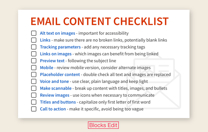
Why you should have an email content checklist
And 12 essential items you should include on your checklist
This guide has been put together by the Blocks Edit team. Having a modular template designed and coded, Blocks Edit is a visual editor that makes your template editable so your content team can build and edit emails and landing pages on their own. It works around your template's structure and code, allowing you to set only editing options that follow brand guidelines, and don't mess with your code.