Adjusting your email for mobile doesn't have to be difficult. It comes down to using columns as a standard layout practice. The columns can then be resized and stacked for mobile screen sizes.
Here's an example of what to add to your columns to do this, with CSS code that acts globally across your template.
The HTML code
Example HTML of columns, with basic styling for desktop:
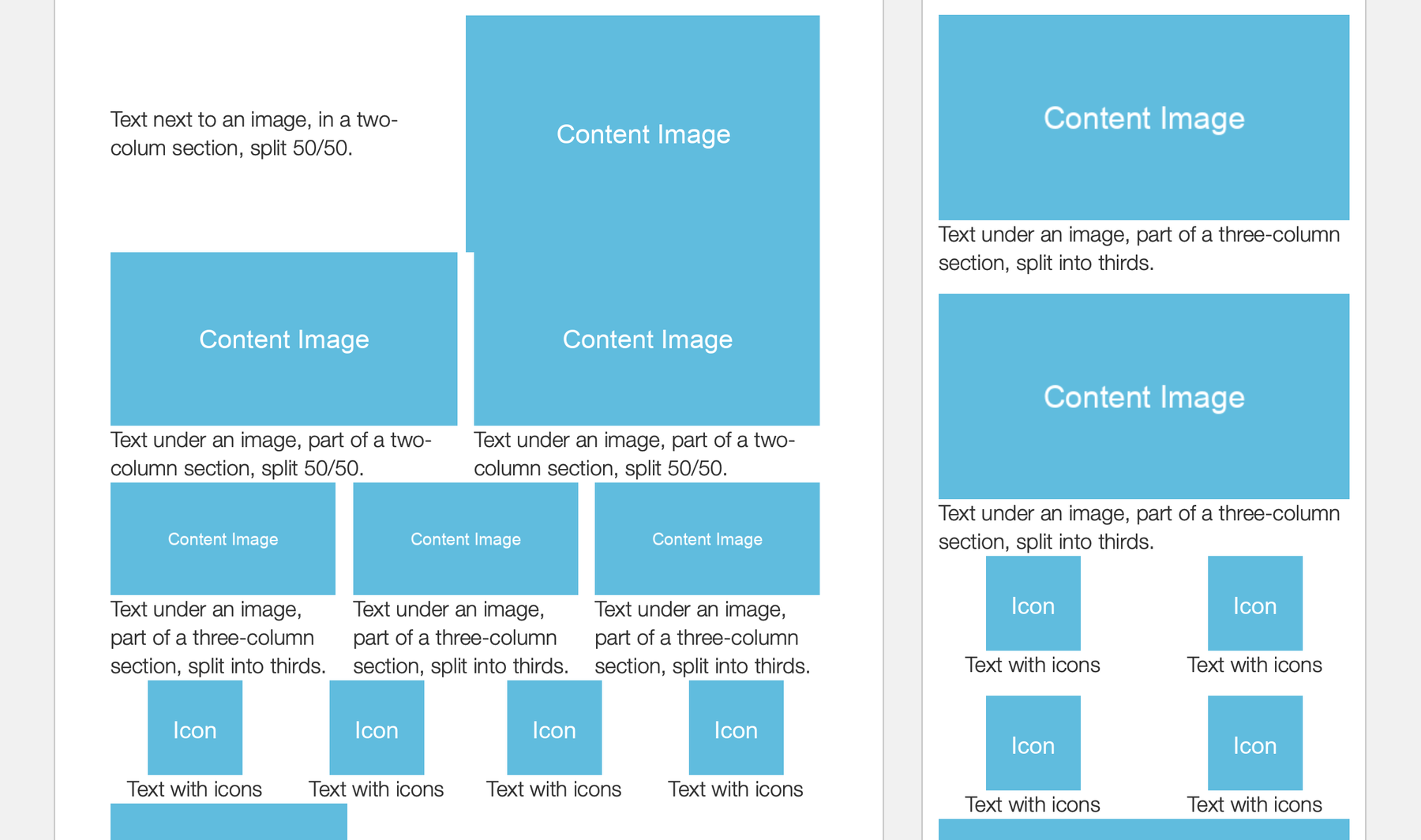
<!-- Two-column section with image on the left -->
<!--[if true]>
<table border="0" cellpadding="0" cellspacing="0" role="presentation" width="100%" style="all: unset; opacity: 0;">
  <tr>
<![endif]-->
<div style="display: table; width: 100%;">
  <!--[if true]><td width="50%" style="padding-right: 0;"><![endif]-->
  <!--[if !true]><!-->
    <div class="column" style="display: table-cell; width: 50%; padding-right: 0;">
  <!--<![endif]-->
    <img height="auto" src="https://dummyimage.com/600x400/60bcde/ffffff&text=Content+Image" width="300" alt="" class="fill" style="display: block; width: 300px; height: auto;">
  <!--[if !true]><!-->
    </div>
  <!--<![endif]-->
  <!--[if true]>
    </td>
    <td width="50%" style="padding-left: 14px;">
  <![endif]-->
  <!--[if !true]><!-->
    <div class="column" style="display: table-cell; width: 50%; padding-left: 14px; vertical-align: middle;">
  <!--<![endif]-->
      <p style="margin: 0; font-family: Helvetica Neue, Helvetica, Arial, sans-serif; font-size: 18px; line-height: 24px; color: #333333; font-weight: 300;">Text next to an image, in a two-colum section, split 50/50.</p>
  <!--[if !true]><!-->
    </div>
  <!--<![endif]-->
  <!--[if true]></td><![endif]-->
</div>
<!--[if true]>
  </tr>
</table>
<![endif]-->
For the adjustments to get made on mobile, just include the column class for each of your layout's columns. For images, add a fill class to the images you want to get scaled along with the column.
The CSS code
And this is the CSS that will do the rest:
@media screen and (max-width: 480px) {
  .column {
    display: block !important;
    width: 100% !important;
    box-sizing: border-box;
    padding: 0 14px 14px 14px !important;
  }
  .column:last-child {
    padding-bottom: 0 !important;
  }
  .column img.fill {
    width: 100% !important;
    height: auto !important;
  }
}
The CSS overrides each column's set width properties along with the padding. And the width of images with the fill class is also overridden and scales them proportionately. You can change the padding amount based on your design.
If you decide to go as far as using four columns, you can add CSS within the media query to make them get shown as two columns at a time on mobile:
.icons .column {
  width: 50% !important;
  float: left;
}
.icons .column:nth-child(3) {
  padding-bottom: 0 !important;
}
For an example of a full layout, take a look at the Starter template which uses this technique.