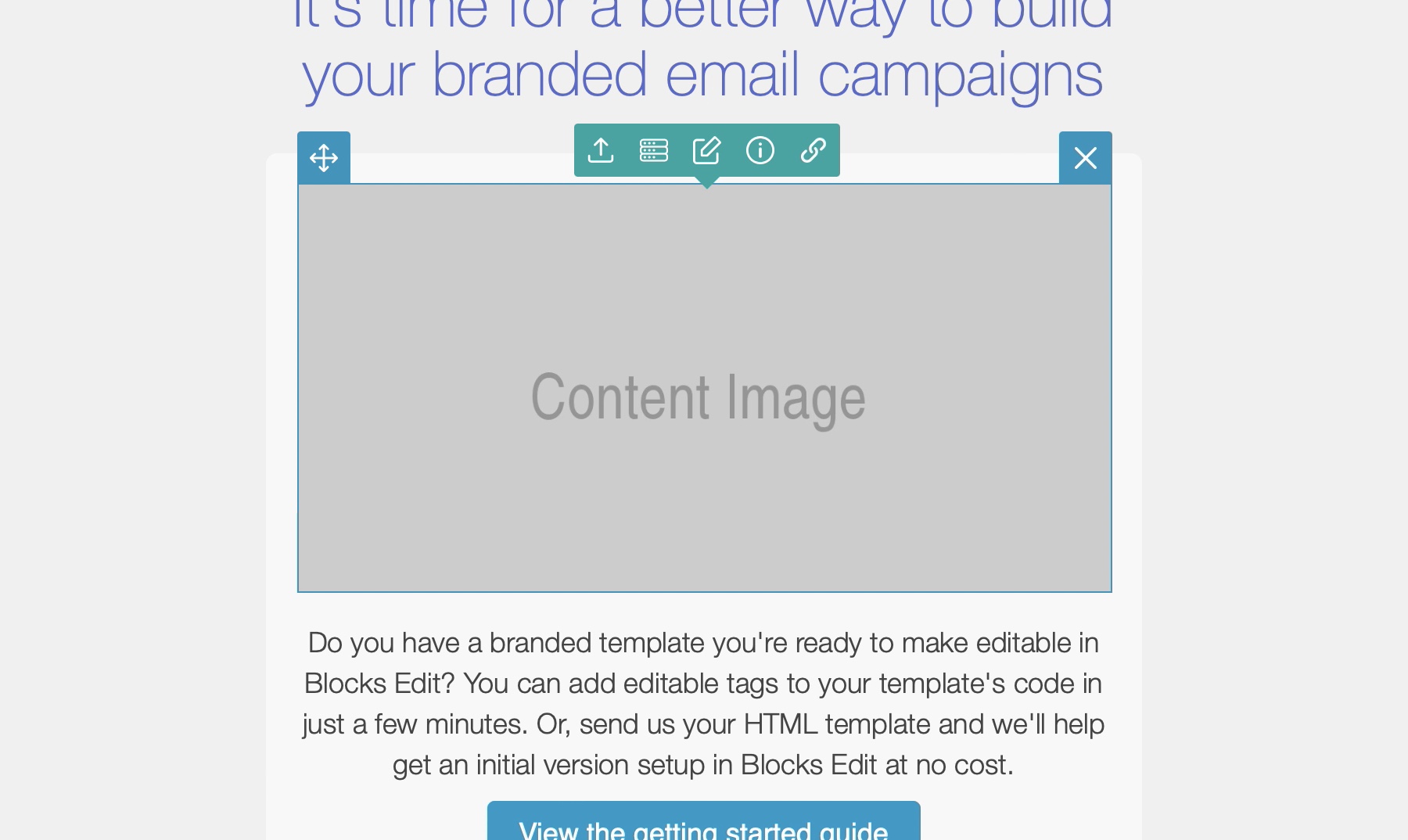
When an image is made editable in a template, you can choose to upload a new image in its place either from your local computer, or if setup, from a source, like an FTP or CDN. Or you can set a custom URL for it. And you have options to add a link along with alt text.
Image sizing
By default, an image’s size is determined from how its placeholder is setup in the template. Blocks Edit refers to the image’s original dimensions and size properties. When a new image is uploaded, there is an option to crop it based on the original image’s dimensions and it gets scaled down to the image’s size. If the image is lower in resolution than the placeholder, the user is prompted to upload one that is higher resolution.
If you have a height: auto style on your image, the cropping and scaling will only constrain to the width and allow for the height to adjust. And vice versa with width: auto.
This applies to JPG and PNG files and includes image compression. GIF files do not get resized or cropped. And PNG files have the option to skip compression for cases where the PNG has already been sized and compressed as needed.
Resizable images
To allow a template image placeholder to resize to the image that’s uploaded, you can use the block-resize tag. This will skip the cropping modal and the image gets resized to both the width and height of the uploaded image.
It will however still take into account pixel density of the original template image. For example, if the template image is 200 pixels wide, but the output is set to 100 pixels (using either the width property or style), it will use that 2:1 ratio for deciding on the size that’s output for the uploaded image. So if your new image is 400 pixels wide, it will stay that size, but will have a set image width of 200 pixels that it gets output in.
You can use min-width and max-width, and min-height and max-height styles to set size limits for the output. So using the pixel density example above, if max-width is set to 600 pixels and your new image is 2000 pixels wide, it gets scaled down to 1200 pixels, taking into account the 2:1 ratio.
For all the details on the editable image properties you can set, take a look at the tags docs. And if you have any questions, feel free to message us.