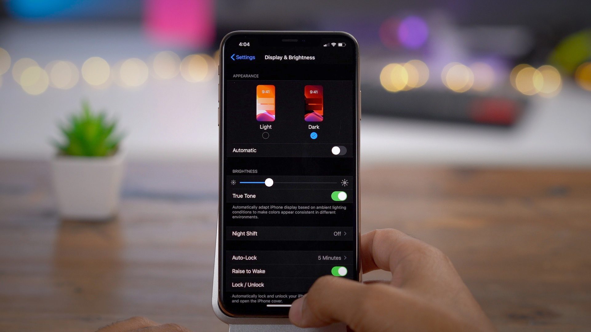
Dark mode was initially introduced for Macs (along with Apple Mail) a couple of years ago. It essentially turns the commonly light user interfaces to a dark version. Since then, it has been adapted the major mobile devices, browsers, and email clients. Besides its visual appeal for some people, dark mode is intended as an accessibility feature, designed as a way to reduce eye strain from staring at our screens all day.
Should you implement dark mode for your email design? Let's first take a look at what's involved in the implementation and how it affects your email's design.
"Besides its visual appeal for some people, dark mode is intended as an accessibility feature, designed as a way to reduce eye strain from staring at our screens all day."
Dark mode definitions
Implementing dark mode works similar to the way media queries work for mobile adjustments:
@media (prefers-color-scheme: dark) { }
There are also added meta tags to let platforms know that your email supports dark mode as an option:
<meta name="color-scheme" content="light dark">
Along with CSS that can be helpful as well:
:root {
  color-scheme: light dark;
}
This is where you would specify which versions of your email are available. Note that some email clients, like Outlook and Gmail, force dark mode by automatically inverting background colors and text and ignore these declarations.
Dark mode design
It shouldn’t be just about inverting a white background to black, and black text to white. The goal to keep in mind is to reduce eye strain. And there are different ways to do that:
- Reduce color contrast - when inverting, avoid using absolute white text on an absolute black background, use shades of each for a softer look. If you decide not to invert your white background, look at making it a light shade of grey to make the screen’s brightness appear softer.
- Enhance the reading experience - keep in mind proper font sizing, weight, and color in the context of dark mode. Text should be a little thinner for a darker background, but not too thin of course.
- Images look different - consider decreasing the brightness and contrast to make images less jarring on a dark background, and more comfortable on the eyes.
- Graphics considerations - include dark versions for transparent graphics, like your logo. And for the regular version, add an outline around dark text as a backup for platforms that force inverted colors. Or, you can just remove the background from being transparent.
Obviously, the potentially drastic color shift can affect design considerably. You'll need to consider whether it works with your current design aesthetic and branding and which of the above makes sense to implement.
"It shouldn’t be just about inverting a white background to black, and black text to white. The goal to keep in mind is to reduce eye strain."
Dark mode decision
To decide on dark mode, it helps to put it into proper context in relation to your design. How does it fit into your other accessibility considerations? Does it make sense to your organization's brand? Would it enhance your audience's experience with your emails?
If you decide to implement dark mode into your email templates, you can now preview and build your emails in dark mode using Blocks Edit. And you can take a look at our updated Starter template for an example of dark mode code.