We all understand the importance of accessibility. About 15% of the world’s population lives with some degree of disability, and 10% of the world’s population have some form of visual impairment. Everyone should be able to read the emails we send out. And there are standards we can follow for making our emails more accessible. And, they may not be as difficult to implement as you think!
"About 15% of the world’s population lives with some degree of disability, and 10% of the world’s population have some form of visual impairment. Everyone should be able to read the emails we send out."
Design rule: is it easy to read?
This should be the one question that permeates through all aspects of your email’s design and can be accomplished the following ways:
- Font size should be at least 14px in size, with lengthier chunks of text recommended at 16px
- Stick to standard type faces and font weights
- Break up content and include proper spacing
- Make sure links are clearly indicated
- Ensure legible color contrast
Having a good contrast ratio means the background and foreground colors can be easily distinguished from each other. For example, black text on a white background offers the best color contrast ratio of 21:1, for the easiest legibility. To meet standards requirements, the minimum contrast ratio should be 7:1 for normal text, and 4.5:1 for large text. Here’s a tool you can use to test your colors.
"Is it easy to read? This should be the one question that permeates through all aspects of your email’s design."
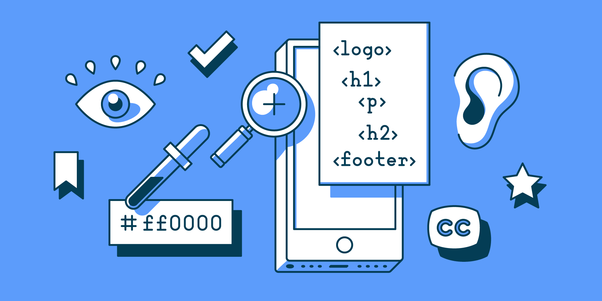
Coding rule: keep in mind semantics
Making your code semantic means giving parts of it meaning so tools for people with disabilities can reference content correctly:
- Set a
role="presentation"on tables you use for design purposes - Use headers for titles (
h1,h2,h3, etc) - Use
ptag for paragraph text - Make sure the
langattribute is set - Encode any special characters
And most importantly: include alt attribute text for all images. The text should be descriptive, but not too long, with each photo or graphic containing unique descriptions. If appropriate, leave the attribute blank instead of removing it completely. Since some email clients block images from being loaded, you can also look at styling your text where possible to make it easier to read when images are turned off.
Here’s another tool to check your email code for all of these accessibility features.
The more you practice these techniques, the easier things get, until it becomes a part of your regular workflow.
We’ve updated our email template guide with accessibility callouts for both design and code, with checklists you can refer to.