Support
Still have questions? Message us.


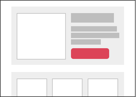
Stand-alone pieces that can be added throughout an email or page. The code for a component needs to be self-contained with its own container in order to be placed among any element.
Components are part of a library on the left sidebar. Once placed, a component can always be moved, or removed. Components can be placed around other editable content. A dashed blue line is shown where a component can be dropped in.
In order to place a component within a section, the section needs at least one content anchor point. This means the section cannot be made of just components, it needs at least one editable text or image area that is not a component. A component cannot be used on a block-edit element.
block-component or -block-component: true
Adding variable names to components saves their metadata. Each unique component requires its own variable name.
data-group="variable-name" or -group-var: variable-name
To add a title for the component in the sidebar, use the data-title attribute.
data-title="Title" or -title-var: 'Title'
  <div class="block-component" data-group="cta" data-title="CTA">

    <a href="#" class="block-edit" data-block="cta-text" style="background-color: #333333; padding: 5px 10px; color: #fff;">Call to Action</a>

  </div>
Variants are alternate versions of components that you can enable to choose from. This allows for preset design features and formatting options that can be switched between. The same variable name should be used for all blocks that apply to its component. Blocks should be immediately adjacent to each other.
  <div class="block-component" data-group="cta">

    <a href="#" class="block-edit" data-block="cta-text" style="background-color: #333333; padding: 5px 10px; color: #fff;">Call to Action</a>

  </div>

  <div class="block-component" data-group="cta">

    <a href="#" class="block-edit" data-block="cta-text" style="background-color: #333333; padding: 5px 10px; color: #fff;">Call to Action</a>

  </div>
Still have questions? Message us.