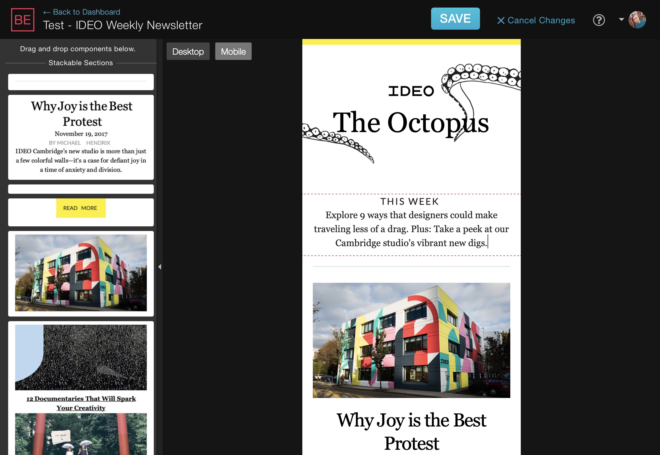
For our spring update, we've decided to focus on a top-requested feature: mobile preview. You can now switch from Desktop to a Mobile view that shrinks the preview window down to a mobile-sized width and adjusts the email to fit (only if it's mobile-friendly of course).
We decided to take it a step further however and also allow updates to be made in the mobile view. Everything you can do in the full Desktop view, you can do in the mobile view. The elements sidebar with components and sections even has its own versions for mobile. This also means that a template can be programmed to allow for mobile-alternative or even mobile-only content areas to be added in.
While the interface looks the same as before with only two new buttons added at the top for the Desktop/Mobile switching, behind-the-scenes, we've overhauled a good part of the core functionality to make it all work very seamlessly. In the process, it allowed us to also make stability improvements overall.
To see an example of the update in action, check out this example template. Just click on 'Mobile' at the top to view its mobile version.
Start using the new mobile view feature today by signing up for free. Request a demo for us to show you how it could work for your template.