At least half of email opens now happen on mobile. So there's no longer an excuse to not enhance your emails for mobile! And the best way to get started is by breaking your email design and content into pieces and think in blocks. Here are some tips.
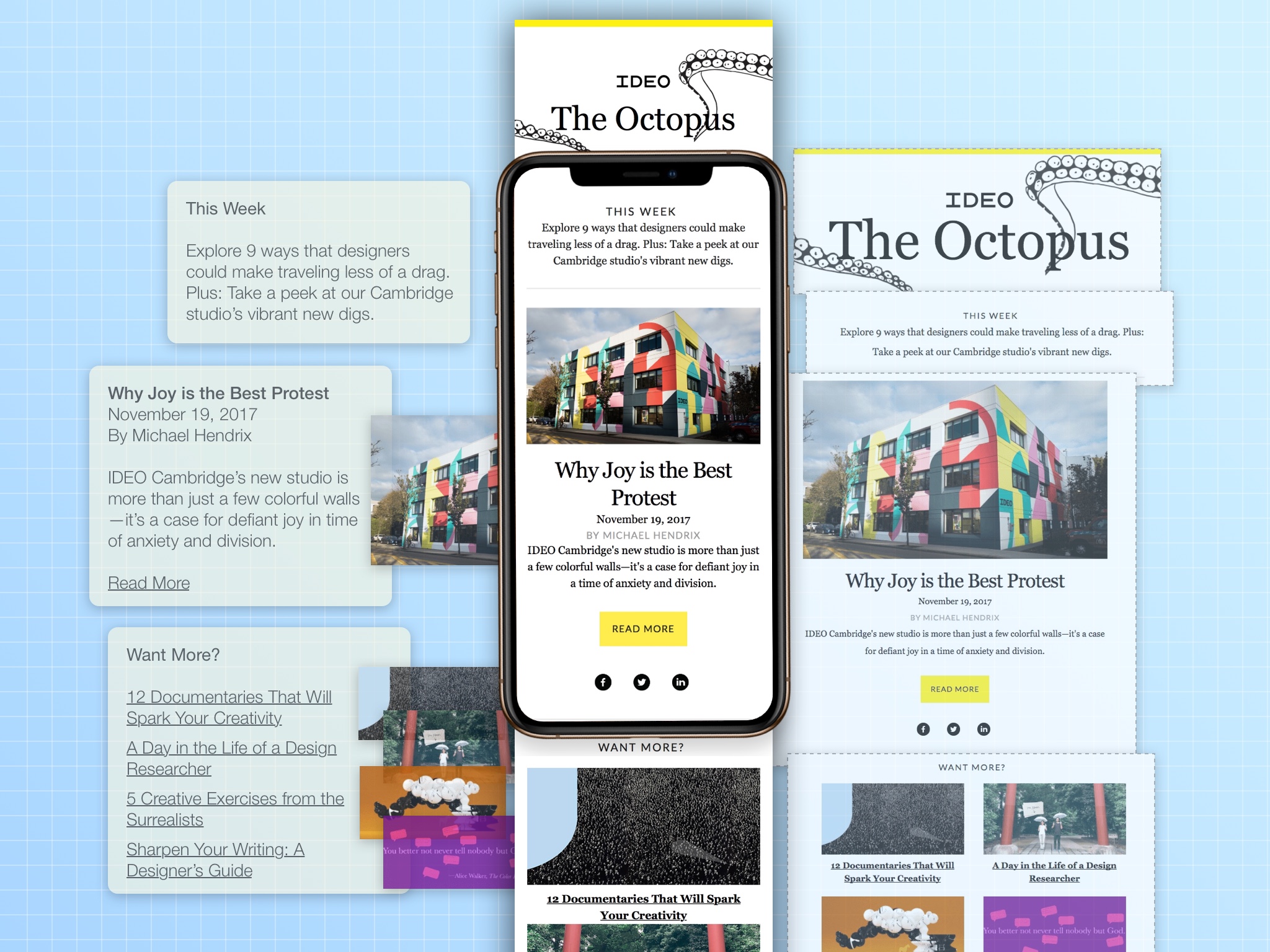
Start with the content
As you develop your content strategy and start writing content for individual emails, make your text skim-able by dividing your message into individual ideas with visual breakpoints your readers can jump to. Use these content-skimming ingredients: titles, callouts, lists, images, graphics, buttons, and links.
"Use these content-skimming ingredients: titles, callouts, lists, images, graphics, buttons, and links."
Keeping mobile in mind
When designing for mobile, there are two routes you can take:
- Designing and building a complete mobile alternative that is shown only on mobile (by hiding the desktop version). This allows for complete flexibility of your design and content, but essentially doubles the work to build an email.
- Using your desktop version and overriding specific design elements to adapt it for mobile. This requires a modular design, which saves time not having to build a second email, and even more time in future emails with a simplified, repeatable design process.
"...a modular design, which saves time not having to build a second email, and even more time in future emails with a simplified, repeatable design process."
The modular method
A modular design consists of stacked sections and columns:
- Stackable sections create breakpoints and group your content to provide visual structure
- Columns allow adjusting from 2-3 columns on desktop to 1-2 columns on mobile
- Promotes developing visual patterns for your content which creates design consistency
- By breaking up your design and content into pieces, it keeps your code more organized and allows for reusable techniques
Over time you develop a system for your email content production which creates a defined, predictable workflow that is more efficient. A library of patterns previously used further spurs ideas for using graphics and images as you write your content. And perhaps most importantly, it naturally makes your content more digestible for your audience to read and take action on.
"...develop a system for your email content production which creates a defined, predictable workflow that is more efficient."
For more on creating a modular template system for your emails, check out our free in-depth guide. And find out how Blocks Edit makes building your emails for mobile easier. Contact us to help you setup your template.