Designing your web pages for consistency, scalability, and collaboration
While a web page can take many different forms: homepage, landing page, product page, blog post, etc, its design works best when it uses consistent elements. This is where components come in. Using the components design approach helps your team streamline its content production. It helps solve the following problems:
Maintains consistency with on-brand visuals and messaging
Team can understand decisions made while having to make less of them
Improves workflow by following best practices and not having to reinvent the wheel each time
Keeps focus on the content — writing and messaging
Fixes design and code debt with a reusable framework for increased efficiency and speed
This guide will provide a simple components format to setting up your design.
Components are based on the design patterns for your website's design. Colors, spacing, typography, etc. Each component provides a format to ensure brand guidelines are followed and the user experience is consistent.
Breaking components down
Use this hierarchy and introduce it to your team as you design and build your templates.
Content Text areas and content images accompanying text; what's found within HTML elements
Components Standalone elements like buttons that work in various contexts and serve specific functions
Regions Repeated groups of content and components, usually in columns, like a listing of content items
Sections Stackable containers between the header and footer that serve to create an overall layout
Don't make it too rigid
Your components shouldn’t feel like something that stifles creativity. Don't make them too rigid, a certain level of hand-crafting is important. Your template should allow for greater creativity within a set of guidelines. The long-term benefit is that a designer can take greater care and give better thought to solving each solution instead of rushing to put together something that comes along.
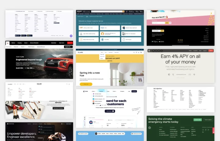
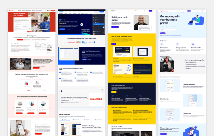
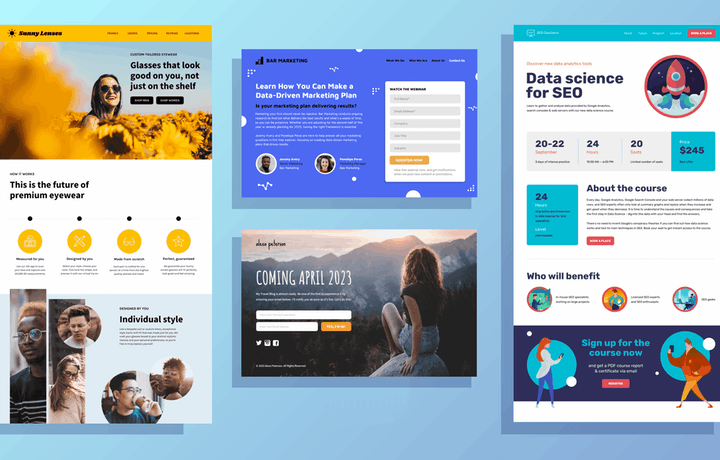
Example web page
The elements of a good web page, using components.
Header navigation
Sub navigation
Hero/intro section
Page title/headline
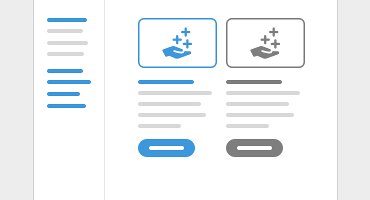
Call-to-action component
Three-column content
Two-column content
Listing of items
Callout section
Links to articles
Call-to-action section
FAQ's
Footer navigation
Creating a component
Define a component as a functional unit that has a purpose and is not part of the library already
Give it a descriptive name that everyone using the system can understand and agree on
Be sure to test accessibility — color contrast ratio, content voice-over, etc
A good component is
Purposeful - all components solve a specific problem
Reusable - components work for multiple use cases
Flexible - they work in many different contexts
Naming things
Language creates a shared understanding and alignment. During the process of figuring out the components your team needs, start developing an approach to naming them.
Your naming conventions will be used as titles for your component design and turn into variables for your code.
As discussions are had, pay attention to how components are naturally described
Use names as you revise design concepts and factor design and code for your components
See what sticks to use in your final resources
Components output
When designing for a web browser, HTML is the protocol for producing a page. Your source of truth should be an HTML file with your components in HTML and CSS code, along with any needed Javascript snippets for added functionality. This format acts as a bridge between the visual design and the backend architecture or CMS setup for your design.
Your components should be shown with examples of placeholder content
Decide on the examples to include based on the content use cases your team needs
Sections should include standalone components even if they are repeated
Even if examples are similar in design structure, the context for content will help your team
Improving your dev workflow
Make sure your components are mobile responsive
Consider dark mode versions for users that have dark mode set
Use JPGs for bigger photos and illustrations; PNGs for graphics that need transparency
For animation, use GIFs; or, consider a short video without audio instead, it may actually end up being smaller in file size than the GIF!
User semantic code for content – for titles (h1, h2, h3, etc), and paragraph tags (p)
Main browsers to test in are Chrome, Safari (especially for mobile), and Firefox
Example output - example HTML output of components with placeholder content Starter page components
Form fields
For designing and coding a form, keep in mind modern browser capabilities. Added functionality and styling options have been built in to make it easier to implement and customize fields:
Browser validation - browsers now validate fields, including notifying the user of required fields by just having a required property added to the field
Date calendar selection - browsers now include a calendar to select a date that comes up when using the input type="date" field
Semantic text fields - a text input field can be specified as email, url, or tel that helps with form validation as well as showing a specific keyboard for mobile
Accent color - using accent-color in your CSS, in the :root, defines the color value for selected radio buttons and checkboxes, along with other form fields that have an accent color
Radio button and checkbox size - you can now set the width and height of a radio button or checkbox to match the size of other fields
File upload button styling - the button that comes along with input type="file" can now be styled to match your design using input::file-selector-button
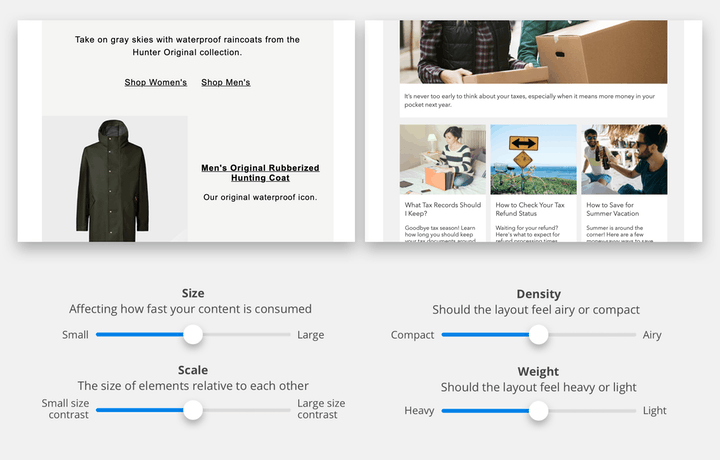
The most important part of any design is the message it's communicating, the content itself. Your components should include some guidelines around how content is produced.
Writing guidelines
Use these general tips to develop the rules around your writing approach:
Identify your value proposition for a focused goal for each page
Plan your information hierarchy to identify information that is most important
Consider the type of message you're sending and whether to add more personality to it, or to get straight to the point
Use a conversational tone as that is usually what's expected from your brand
Be creative in the mechanical elements (headlines, call-to-action buttons, etc)
Make sure your call-to-action is action-oriented
Best practices
Ensure your messaging matches - send people to a page that matches their expectations with landing page copy (and design) that follows the ads you’re running in search or social.
Intro/hero area - keep your main headline, unique sales proposition, and your call to action highly visible. They should be among the first elements that visitors see before scrolling.
Compelling, benefits-driven content - a feature is a specific quality of your product or service, while a benefit describes a positive impact that the feature has.
Show product or service being used - photos and videos showing your product or service in a real-life context helps visitors imagine themselves as your customer. It’s also an effective shorthand for explaining how your product or service works.
Provide social proof - include testimonials as a way to show authenticity. You can humanize these testimonials by including personal details, like full names, job titles, place of residence, date of purchase, biographical details, portraits, or even video.
Break up content - use headlines and bullet points to make your copy more scannable.
Repeat your CTA - place your CTA at the beginning and the end, and even in the middle if you have a lot of content.
Make your CTA specific - avoid bland button text like “CLICK HERE” or “SUBMIT.” Use conversational language and let your visitors know exactly what they’ll be getting for their click.
Consider an FAQ’s section - Provide a Frequently Asked Questions section, usually towards the end, to make your argument and remove any remaining doubts before visitors reach the end of the page.
Skimmable content
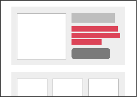
Feature sections
Feature sections on a page highlight ideas in shorter form content and usually include a call-to-action, or links to further explore each key idea.
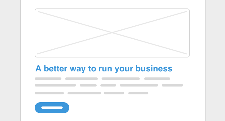
Single-column - in its most standard form, this consists of a headline, a description, usually kept short, an optional image, and an optional call-to-action button.
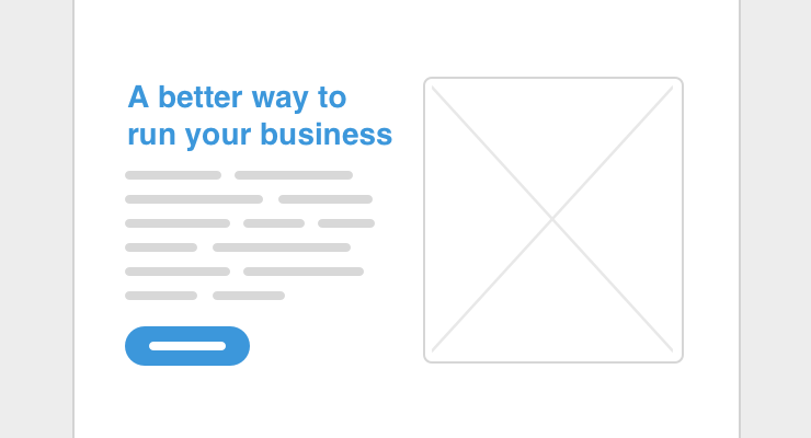
Two-column - this can be a two-column version of the single-column consisting of title, description, image, and button. Or, an image can go on the left or the right side of the text and button.
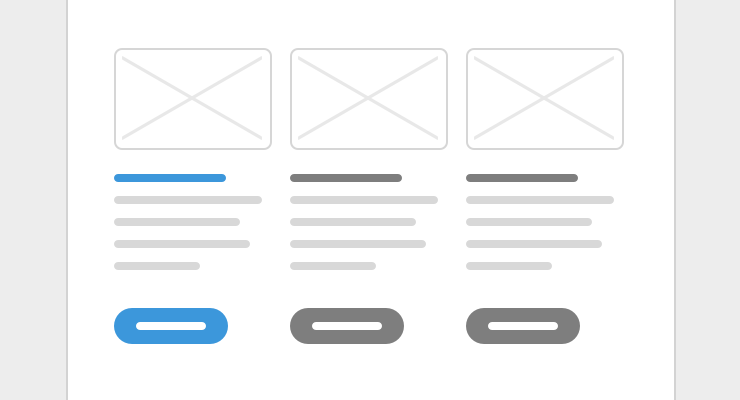
Three-column - same as a single-column, but times three! Icons or simple graphics can be used instead of squeezing in images, or no images at all can also work. A secondary style for buttons works best here, or a text link.
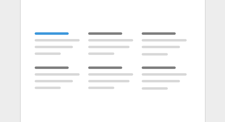
Features grid - a listing of items, usually in multiple columns. If a call-to-action is used at all, it should either be in the form of text links for an item, or at the end of all the items.
Call-to-action - standalone section focused on taking an actionable step. This works best at the end of a page to act as a next step, but for longer pages, it can also go in-between content sections.
Testimonial - in the form of a quote followed by the author of the quote. A testimonial can be placed among other feature content sections, or as part of a section with multiple testimonials.
Listings
Essentially a group of related items that offer an easier way for users to browse through collections that may otherwise be overwhelming to go through.
Blog archive - post listings would normally be part of an archive, on their own page, possibly with multiple pages for older posts. They would be ordered by date, with the latest posts at the top.
Filtered products - usually a thumbnail, title, and price are shown. Products tend to include menus of categories and other filters that are shown at the top or on a sidebar on the left.
Upcoming events - would include the date, title, and a link with info for how to attend the event. Also ordered by date, but usually highlighting future events at the top, with the latest upcoming one first.
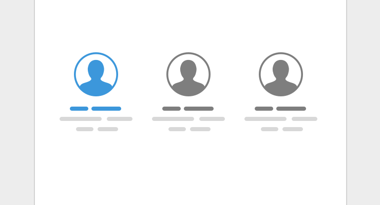
Misc - team members for an about page, related products, product reviews, search results, property listings, a business directory, restaurant menus, etc.
Article content
Breaking up content for blog posts and other types of articles (eg: help docs), making it easier to read. From basic text formatting options to added images that accompany the text.
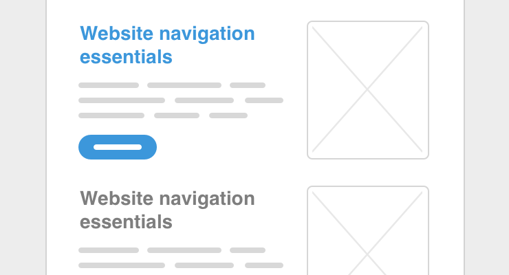
Titles and intro text - the main title of the article and subtitles used throughout the article. Summary or intro text is often used to give more context to the title.
Bullet list - Providing a bullet list is a good way to make multiple points that are easier to digest their information and visually easier to read through.
Image with caption - where it makes sense within the article, an image is added in-between the text. Either an illustration or photo.
Pull quote - pull quotes work well for highlighting certain ideas within an article that are particularly relevant.
Callout - a callout makes a piece of content stand out from the rest of the text. It can often include an illustration or photo.
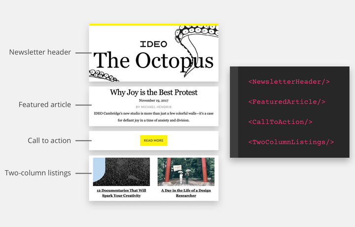
Content components - common formatting patterns that can be mixed and matched Starter content components
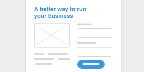
Landing pages
A landing page is a standalone web page that potential customers go to when they click through from an email, ad, or other campaign. Landing pages serve a specific purpose in a specific moment of a campaign to a target audience. Here are some cases where you would want to take the landing page approach:
Audience segments - if you can divide your audience into different groups, consider creating separate pages for each one to enhance the experience for each group
Products or services - if you offer a number of different products or services, you can create separate pages for each one (or category, if that makes more sense) to highlight the unique benefits of each individual thing you offer
For search engine optimization - having lots of pages helps SEO, with more of your pages for search engines to index for increased chances of visitors making their way to your site
To target long-tail keywords - highly specific keywords or key phrases that tend to be four or more words, making it easier to rank than keywords with fewer words which are more competitive
Landing page design guide - how to build landing pages more consistently and efficiently Read guide
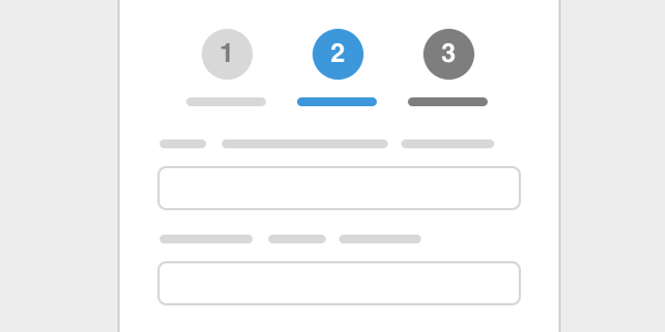
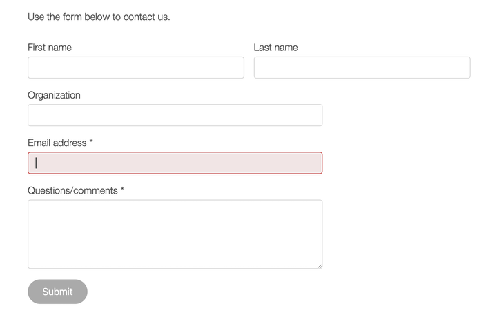
Forms
Forms are useful for collecting information from visitors, getting specific details to help with following up. The first thing to keep in mind is to only ask for fundamental information. No one enjoys filling out forms so keep them short!
Landing page form - collect only info that is relevant to what your visitor is trying to accomplish; make it clear in your copy why the information is needed
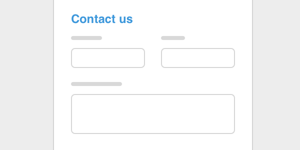
Contact form - should consist of a text area for the question/comment message along with a means to reply back to the person reaching out
Feedback/survey - helpful for your product or service, allowing customers to share thoughts on their experience; questions can be in the form of multiple choices or as open-ended text areas
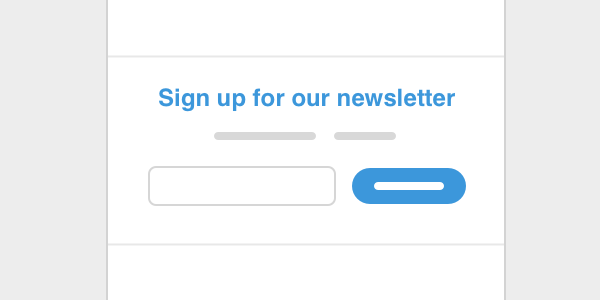
Newsletter sign-up - an email address is all you need for a newsletter sign-up, with a good intro explaining why users would want to sign up and what they can expect from the newsletter
Web form design guide - how to design forms that are consistent and efficient to setup Read guide
Your components are only as strong as your relationships with the team who uses them. Share the design process with your team and develop tools for them to use your components.
Rolling out to your team
Two ways to rollout components: Either incrementally, or with a large-scale redesign. Unless there's a need to redesign your campaigns, you should go with an incremental rollout.
Your components can be big or small: Only build aspects that you need. Start small and build up. Focus on not only building tools, but creating a shared language.
Maintaining your components: As your template gets adapted, you'll have to go from designing components to getting feedback and tracking usage. Be prepared to maintain updates to your template as your marketing evolves, along with your team.
Include people in the process
Talk to people using the system - find out what they need
Get help with gathering assets - this also helps develop a shared understanding of how to measure quality components
Be open to feedback - if something is unclear, talk through and get feedback on how to improve
Make it easy - provide a point of contact, support ticketing system, discussion forum, etc
Include link to system in other processes - new team member on-boarding, company-wide demos and emails, etc
A good template includes the “why” and “how” of decisions made:
How and when to use?
How does it fit into the system?
What’s the rationale behind it?
Single source of truth
Having your components in an HTML file allows providing your template as a web page you can send a link to:
Easy to maintain - designers, developers, and organizers can make updates
Format that anyone can access - everyone can always go to the same URL
Centralized - updated without too many versions that need to be passed around
Components and CMS's
If you're considering using a CMS for your team to build out web pages, look for ones that take the components approach to building. Many modern CMS's do this and even allow drag and drop editing for your components.
CMS from your components
This guide has been put together by the Blocks Edit team. Having a template with reusable components for your team to use, Blocks Edit supports using placeholder content so you're able to use your HTML to translate directly into the CMS and make your components visually editable.


 Content
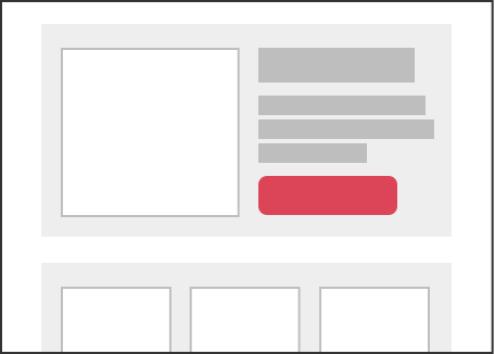 Components
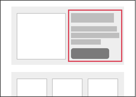 Regions
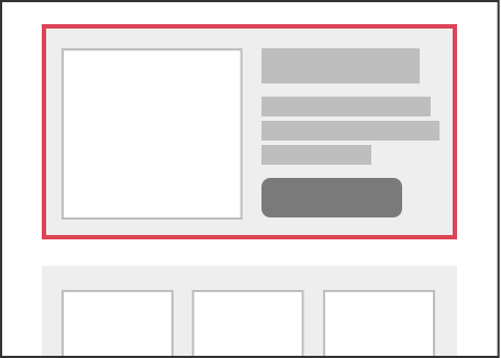 Sections