
Navigation on a website can take many shapes and forms. Your site’s information architecture will help you determine the best way to organize content based on what your visitors are looking for. And being aware of the different kinds of menus that are available to you can help with deciding on the best experience for them.
Header
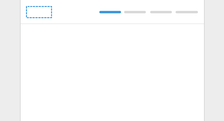
The header, typically a horizontal bar across the top of your site, is the most common place for your site’s primary navigation. It’s where visitors expect to look when deciding where to go on your site.
This header area also includes your logo in the upper left, and can include a secondary menu in the upper right, usually in the form of a call-to-action, like Sign Up.
Dropdown
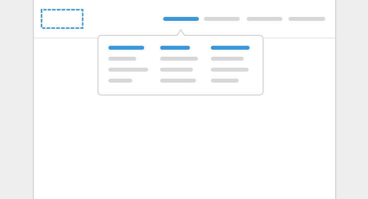
Also in the header navigation, you can provide dropdown submenus for your main menu items. This allows the visitor to dig deeper into each of the top level sections of your site and find content that may be more specific to what they’re looking for.
The submenu, usually accessed by mousing over main menu items, can have just a list of links. Or, it can take the form of a mega menu, filling up more of the screen, where the list of items can be further broken down into categories and additional information can be provided for each of the links.
Subnav
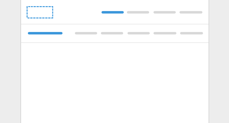
Besides as a dropdown, a subnav can also be added under the primary navigation once a visitor has clicked in to one of the pages of a particular section of the site. This allows them to see where they are and what related content they can continue to browse through.
Sidebar

Or, instead of at the top, a submenu can go on the side, in a vertical list. This works best when the list of submenu items gets long and those submenu items also have submenu items!
Footer
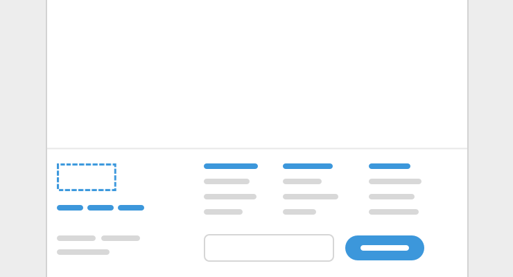
Similar to the header, there are different ways to setup the footer of a page:
- A listing of subpages without a dropdown
- Links to supplemental content you wouldn’t find elsewhere
- Additional categories of links, like social media
- Signup for your newsletter
- Any needed legal copy
Other menu formats
- Hamburger menu - called a hamburger menu because it comes in the form of an icon that’s three horizontal lines on top of each other, it’s primarily used on mobile to open a website’s navigation though it can work on desktop as a way to simplify the header area
- Breadcrumbs - horizontal list of links used to show hierarchy of pages and where the visitor is currently, with links to go up to parent sections
- Link listings - commonly used on the main page of help docs, this format shows an overview of categories and subcategories
For working examples of website navigation that you can refer to when designing your site, download our starter theme.
Setup your own website navigation as visually editable components for your team to build out and edit pages with the Blocks Edit editor.