
Feature sections on a page highlight ideas in short-form content. They provide a format for content to be skimmed through and usually include a call-to-action, or links to further explore the idea. These different forms of content sections can be mixed and matched depending on the information needed on each page.
Single-column
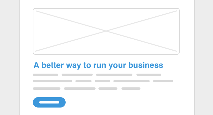
In its most standard form, this consists of a headline, a description, usually kept short, an optional image, and an optional call-to-action button. A visitor skims the page to read the headline, looks at the related image, and reads the text for more info, then decides whether to take the next step by clicking on the button.
Two-column
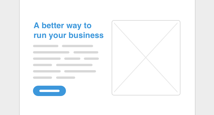
This can be a two-column version of the single-column consisting of title, description, image, and button. Or, an image can go on the left or the right side of the text and button. The image on the left or right approach allows for having a listing of multiple sections.
Three-column
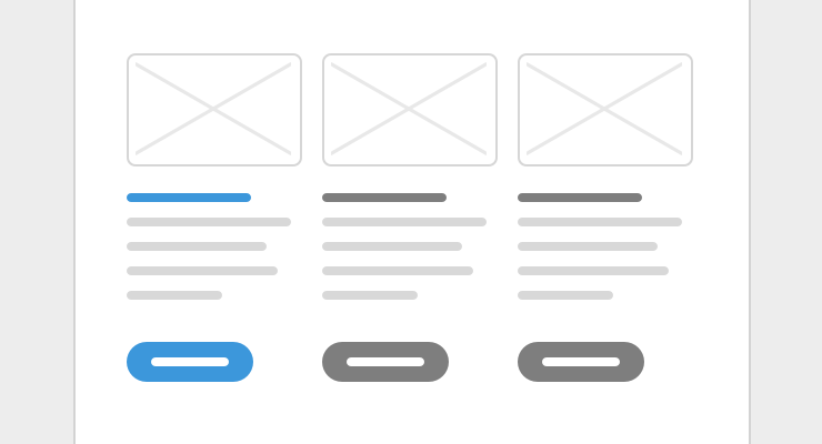
Same as a single-column, but times three! Icons or simple graphics can be used instead of squeezing in images, or no images at all can also work. A secondary style for buttons works best here, or a text link.
Features grid
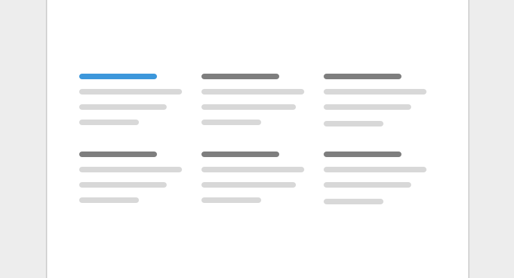
A listing of items, usually in multiple columns. Because of the potential amount of items, icons can be helpful to differentiate between each one. If a call-to-action is used at all, it should either be in the form of text links for an item, or at the end of all the items.
Call-to-action

This would a standalone section focused on taking an actionable step. Typically in the form of a headline, short text, and a button. This works best at the end of a page to act as a next step, but for longer pages, it can also go in-between content sections.
Testimonial

In the form of a quote followed by the author of the quote. A testimonial can be placed among other feature content sections, or as part of a section with multiple testimonials.
For working examples of feature content that you can refer to when designing your site, download our starter theme.
Setup your own feature content as visually editable components for your team to build out and edit pages with the Blocks Edit editor.