It can be tricky to get spacing that's consistent across your template and also doesn't cause potential unintended side effects with elements within your layout. Here are a couple of techniques for doing so that work with any email design. And with code that is supported across email clients.
Spacing for sections
Because of how sections stack on top of each other, there's no one way to add spacing between them. Depending on which sections are above or below, some could use larger, or smaller spacing, while others look good without any spacing at all. So the best way to go about section spacing is to use a spacer that can be plugged in as needed:
<div style="width: 100%;"><p style="float: left; margin: 0; margin-bottom: 14px; width: 100%; line-height: 0;"> </p></div>
You can also do this among elements within a section:
<p style="display: inline-block; margin: 0; margin-bottom: 14px; width: 100%; line-height: 0;"> </p>
Spacing for columns
The code examples below calculate and add padding for various types of columns using a simple method that works for any kind of layout.
Single-column content section
No padding added since container matches body background color.
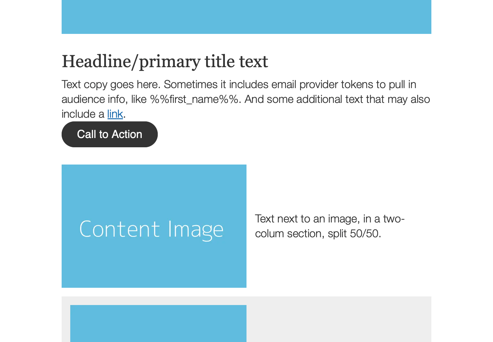
<p style="margin: 0; font-family: Helvetica Neue, Helvetica, Arial, sans-serif;">Text copy goes here. Sometimes it includes email provider tokens to pull in audience info, like %%first_name%%. And some additional text that may also include a <a href="#" style="text-decoration: underline; color: #1467ac;">link</a>.</p>
Single-column with background color
Padding added as background color is used that stands out from the body.
<table role="presentation" width="100%" cellspacing="0" cellpadding="0">
  <tr>
    <td class="column alt" style="background-color: #eeeeee; padding: 14px;">
      <p style="margin: 0; margin-bottom: 10px; font-family: Helvetica Neue, Helvetica, Arial, sans-serif; font-size: 18px; line-height: 24px; color: #333333; font-weight: 300;">More text copy goes here. It could be as long as you need it to be as there is plenty of room to let it flow!</p>
    </td>
  </tr>
</table>
Two-column with left image
Limited padding added to separate text column from image column.
<!--[if true]>
<table border="0" cellpadding="0" cellspacing="0" role="presentation" width="100%" style="all: unset; opacity: 0;">
  <tr>
<![endif]-->
<div style="display: table; width: 100%;">
  <!--[if true]><td width="50%" style="padding-right: 0;"><![endif]-->
  <!--[if !true]><!-->
    <div class="column" style="display: table-cell; width: 50%; padding-right: 0;">
  <!--<![endif]-->
      <img height="auto" src="https://dummyimage.com/600x400/60bcde/ffffff&text=Content+Image" width="300" alt="" class="fill" style="display: block; width: 300px; height: auto;">
  <!--[if !true]><!-->
    </div>
  <!--<![endif]-->
  <!--[if true]>
    </td>
    <td width="50%" style="padding-left: 14px;">
  <![endif]-->
  <!--[if !true]><!-->
    <div class="column" style="display: table-cell; width: 50%; padding-left: 14px; vertical-align: middle;">
  <!--<![endif]-->
      <p style="margin: 0; font-family: Helvetica Neue, Helvetica, Arial, sans-serif; font-size: 18px; line-height: 24px; color: #333333; font-weight: 300;">Text next to an image, in a two-colum section, split 50/50.</p>
  <!--[if !true]><!-->
    </div>
  <!--<![endif]-->
  <!--[if true]></td><![endif]-->
</div>
<!--[if true]>
  </tr>
</table>
<![endif]-->
Two-column with left image and background color
Additional padding added for container having background color.
<!--[if true]>
<table border="0" bgcolor="#eeeeee" cellpadding="0" cellspacing="0" role="presentation" width="100%" style="all: unset; opacity: 0;">
  <tr>
<![endif]-->
<div style="display: table; width: 100%; background-color: #eeeeee;">
  <!--[if true]><td width="50%" style="padding: 14px; padding-right: 0;"><![endif]-->
  <!--[if !true]><!-->
    <div class="column alt" style="display: table-cell; width: 50%; padding: 14px; padding-right: 0;">
  <!--<![endif]-->
      <img height="auto" src="https://dummyimage.com/600x400/60bcde/ffffff&text=Content+Image" width="286" alt="" class="fill" style="display: block; width: 286px; height: auto;">
  <!--[if !true]><!-->
    </div>
  <!--<![endif]-->
  <!--[if true]>
    </td>
    <td width="50%" style="padding: 14px;">
  <![endif]-->
  <!--[if !true]><!-->
    <div class="column alt" style="display: table-cell; width: 50%; padding: 14px; vertical-align: middle;">
  <!--<![endif]-->
      <p style="margin: 0; font-family: Helvetica Neue, Helvetica, Arial, sans-serif; font-size: 18px; line-height: 24px; color: #333333; font-weight: 300;">Text next to an image, in a two-colum section, split 50/50.</p>
  <!--[if !true]><!-->
    </div>
  <!--<![endif]-->
  <!--[if true]></td><![endif]-->
</div>
<!--[if true]>
  </tr>
</table>
<![endif]-->
Two-column with images
Padding set to 50% of standard amount for in-between column spacing.
<!--[if true]>
<table border="0" cellpadding="0" cellspacing="0" role="presentation" width="100%" style="all: unset; opacity: 0;">
  <tr>
<![endif]-->
<div style="display: table; width: 100%;">
  <!--[if true]><td width="50%" style="padding-right: 7px;"><![endif]-->
  <!--[if !true]><!-->
    <div class="column" style="display: table-cell; width: 50%; padding-right: 7px;">
  <!--<![endif]-->
      <img height="auto" src="https://dummyimage.com/600x300/60bcde/ffffff&text=Content+Image" width="293" alt="" class="fill" style="display: block; width: 293px; height: auto;">
      <p style="margin: 0; font-family: Helvetica Neue, Helvetica, Arial, sans-serif; font-size: 18px; line-height: 24px; color: #333333; font-weight: 300;">Text under an image, part of a two-column section, split 50/50.</p>
  <!--[if !true]><!-->
    </div>
  <!--<![endif]-->
  <!--[if true]>
    </td>
    <td width="50%" style="padding-left: 7px;">
  <![endif]-->
  <!--[if !true]><!-->
    <div class="column" style="display: table-cell; width: 50%; padding-left: 7px;">
  <!--<![endif]-->
      <img height="auto" src="https://dummyimage.com/600x300/60bcde/ffffff&text=Content+Image" width="293" alt="" class="fill" style="display: block; width: 293px; height: auto;">
      <p style="margin: 0; font-family: Helvetica Neue, Helvetica, Arial, sans-serif; font-size: 18px; line-height: 24px; color: #333333; font-weight: 300;">Text under an image, part of a two-column section, split 50/50.</p>
  <!--[if !true]><!-->
    </div>
  <!--<![endif]-->
  <!--[if true]></td><![endif]-->
</div>
<!--[if true]>
  </tr>
</table>
<![endif]-->
Two-column with images and background color
Additional padding plus 50% padding of standard for in-between columns.
<!--[if true]>
<table border="0" bgcolor="#eeeeee" cellpadding="0" cellspacing="0" role="presentation" width="100%" style="all: unset; opacity: 0;">
  <tr>
<![endif]-->
<div style="display: table; width: 100%; background-color: #eeeeee;">
  <!--[if true]><td width="50%" style="padding: 14px; padding-right: 7px;"><![endif]-->
  <!--[if !true]><!-->
    <div class="column alt" style="display: table-cell; width: 50%; padding: 14px; padding-right: 7px;">
  <!--<![endif]-->
      <img height="auto" src="https://dummyimage.com/600x300/60bcde/ffffff&text=Content+Image" width="278" alt="" class="fill" style="display: block; width: 278px; height: auto;">
      <p style="margin: 0; font-family: Helvetica Neue, Helvetica, Arial, sans-serif; font-size: 18px; line-height: 24px; color: #333333; font-weight: 300;">Text under an image, part of a two-column section, split 50/50.</p>
  <!--[if !true]><!-->
    </div>
  <!--<![endif]-->
  <!--[if true]>
    </td>
    <td width="50%" style="padding: 14px; padding-left: 7px;">
  <![endif]-->
  <!--[if !true]><!-->
    <div class="column alt" style="display: table-cell; width: 50%; padding: 14px; padding-left: 7px;">
  <!--<![endif]-->
      <img height="auto" src="https://dummyimage.com/600x300/60bcde/ffffff&text=Content+Image" width="278" alt="" class="fill" style="display: block; width: 278px; height: auto;">
      <p style="margin: 0; font-family: Helvetica Neue, Helvetica, Arial, sans-serif; font-size: 18px; line-height: 24px; color: #333333; font-weight: 300;">Text under an image, part of a two-column section, split 50/50.</p>
  <!--[if !true]><!-->
    </div>
  <!--<![endif]-->
  <!--[if true]></td><![endif]-->
</div>
<!--[if true]>
  </tr>
</table>
<![endif]-->
Three-column with images
Same 50% padding of standard spacing applied to three columns.
<!--[if true]>
<table border="0" cellpadding="0" cellspacing="0" role="presentation" width="100%" style="all: unset; opacity: 0;">
  <tr>
<![endif]-->
<div style="display: table; width: 100%;">
  <!--[if true]><td width="33.3%" style="padding-right: 7px;"><![endif]-->
  <!--[if !true]><!-->
    <div class="column" style="display: table-cell; width: 33.3%; padding-right: 7px;">
  <!--<![endif]-->
      <img height="auto" src="https://dummyimage.com/400x200/60bcde/ffffff&text=Content+Image" width="190" alt="" class="fill" style="display: block; width: 190px; height: auto;">
      <p style="margin: 0; font-family: Helvetica Neue, Helvetica, Arial, sans-serif; font-size: 18px; line-height: 24px; color: #333333; font-weight: 300;">Text under an image, part of a three-column section, split into thirds.</p>
  <!--[if !true]><!-->
    </div>
  <!--<![endif]-->
  <!--[if true]>
    </td>
    <td width="33.3%" style="padding-right: 7px; padding-left: 7px;">
  <![endif]-->
  <!--[if !true]><!-->
    <div class="column" style="display: table-cell; width: 33.3%; padding-right: 7px; padding-left: 7px;">
  <!--<![endif]-->
      <img height="auto" src="https://dummyimage.com/400x200/60bcde/ffffff&text=Content+Image" width="190" alt="" class="fill" style="display: block; width: 190px; height: auto;">
      <p style="margin: 0; font-family: Helvetica Neue, Helvetica, Arial, sans-serif; font-size: 18px; line-height: 24px; color: #333333; font-weight: 300;">Text under an image, part of a three-column section, split into thirds.</p>
  <!--[if !true]><!-->
    </div>
  <!--<![endif]-->
  <!--[if true]>
    </td>
    <td width="33.3%" style="padding-left: 7px;">
  <![endif]-->
  <!--[if !true]><!-->
    <div class="column" style="display: table-cell; width: 33.3%; padding-left: 7px;">
  <!--<![endif]-->
      <img height="auto" src="https://dummyimage.com/400x200/60bcde/ffffff&text=Content+Image" width="190" alt="" class="fill" style="display: block; width: 190px; height: auto;">
      <p style="margin: 0; font-family: Helvetica Neue, Helvetica, Arial, sans-serif; font-size: 18px; line-height: 24px; color: #333333; font-weight: 300;">Text under an image, part of a three-column section, split into thirds.</p>
  <!--[if !true]><!-->
    </div>
  <!--<![endif]-->
  <!--[if true]></td><![endif]-->
</div>
<!--[if true]>
  </tr>
</table>
<![endif]-->
Three-column with images and background color
And three columns with a background color.
<!--[if true]>
<table border="0" bgcolor="#eeeeee" cellpadding="0" cellspacing="0" role="presentation" width="100%" style="all: unset; opacity: 0;">
  <tr>
<![endif]-->
<div style="display: table; width: 100%; background-color: #eeeeee;">
  <!--[if true]><td width="33.3%" style="padding: 14px; padding-right: 7px;"><![endif]-->
  <!--[if !true]><!-->
    <div class="column alt" style="display: table-cell; width: 33.3%; padding: 14px; padding-right: 7px;">
  <!--<![endif]-->
      <img height="auto" src="https://dummyimage.com/400x200/60bcde/ffffff&text=Content+Image" width="181" alt="" class="fill" style="display: block; width: 181px; height: auto;">
      <p style="margin: 0; font-family: Helvetica Neue, Helvetica, Arial, sans-serif; font-size: 18px; line-height: 24px; color: #333333; font-weight: 300;">Text under an image, part of a three-column section, split into thirds.</p>
  <!--[if !true]><!-->
    </div>
  <!--<![endif]-->
  <!--[if true]>
    </td>
    <td width="33.3%" style="padding: 14px; padding-right: 7px; padding-left: 7px;">
  <![endif]-->
  <!--[if !true]><!-->
    <div class="column alt" style="display: table-cell; width: 33.3%; padding: 14px; padding-right: 7px; padding-left: 7px;">
  <!--<![endif]-->
      <img height="auto" src="https://dummyimage.com/400x200/60bcde/ffffff&text=Content+Image" width="181" alt="" class="fill" style="display: block; width: 181px; height: auto;">
      <p style="margin: 0; font-family: Helvetica Neue, Helvetica, Arial, sans-serif; font-size: 18px; line-height: 24px; color: #333333; font-weight: 300;">Text under an image, part of a three-column section, split into thirds.</p>
  <!--[if !true]><!-->
    </div>
  <!--<![endif]-->
  <!--[if true]>
    </td>
    <td width="33.3%" style="padding: 14px; padding-left: 7px;">
  <![endif]-->
  <!--[if !true]><!-->
    <div class="column alt" style="display: table-cell; width: 33.3%; padding: 14px; padding-left: 7px;">
  <!--<![endif]-->
      <img height="auto" src="https://dummyimage.com/400x200/60bcde/ffffff&text=Content+Image" width="181" alt="" class="fill" style="display: block; width: 181px; height: auto;">
      <p style="margin: 0; font-family: Helvetica Neue, Helvetica, Arial, sans-serif; font-size: 18px; line-height: 24px; color: #333333; font-weight: 300;">Text under an image, part of a three-column section, split into thirds.</p>
  <!--[if !true]><!-->
    </div>
  <!--<![endif]-->
  <!--[if true]></td><![endif]-->
</div>
<!--[if true]>
  </tr>
</table>
<![endif]-->
For an example of a full template that uses these spacing techniques, take a look at the Starter template.